Two years after launching, COVID-19 took a toll on FlexIt’s core business (flexible gym access), forcing a pivot to a completely new offering—virtual personal training. With another platform to be built, an expanded business model, and a shift in our target demographic, our brand needed evolve to match this new vision.

I designed and evaluated new branding, UI, and visual design concepts across the mobile app, web, and digital presence.

I collaborated with various stakeholders across the company to develop a visual and digital brand identity that aligned with our business goals.

I documented comprehensive brand guidelines and applied these foundations to our design system.

I built in inaugural design system to support product growth and cross-team collaboration.
Mar 2020 - Sep 2020
Creative Director (me)
Senior Graphic Designer
Director of Engineering
Marketing Director
Design systems
UI design
Documentation
Branding
Stakeholder management
From side-hustle freelancer to Creative Director in just two years, my role at FlexIt progressed quickly. I oversaw all things design at this small startup, despite my background in product (and not necessarily branding). But because we were a product-forward SaaS company, I relied heavily on my UI design instincts to lead the creation of a modern, digital-first brand.
As FlexIt evolved from a single fitness platform into a holistic health and wellness ecosystem, the need for a comprehensive visual and digital design system became more imperative.
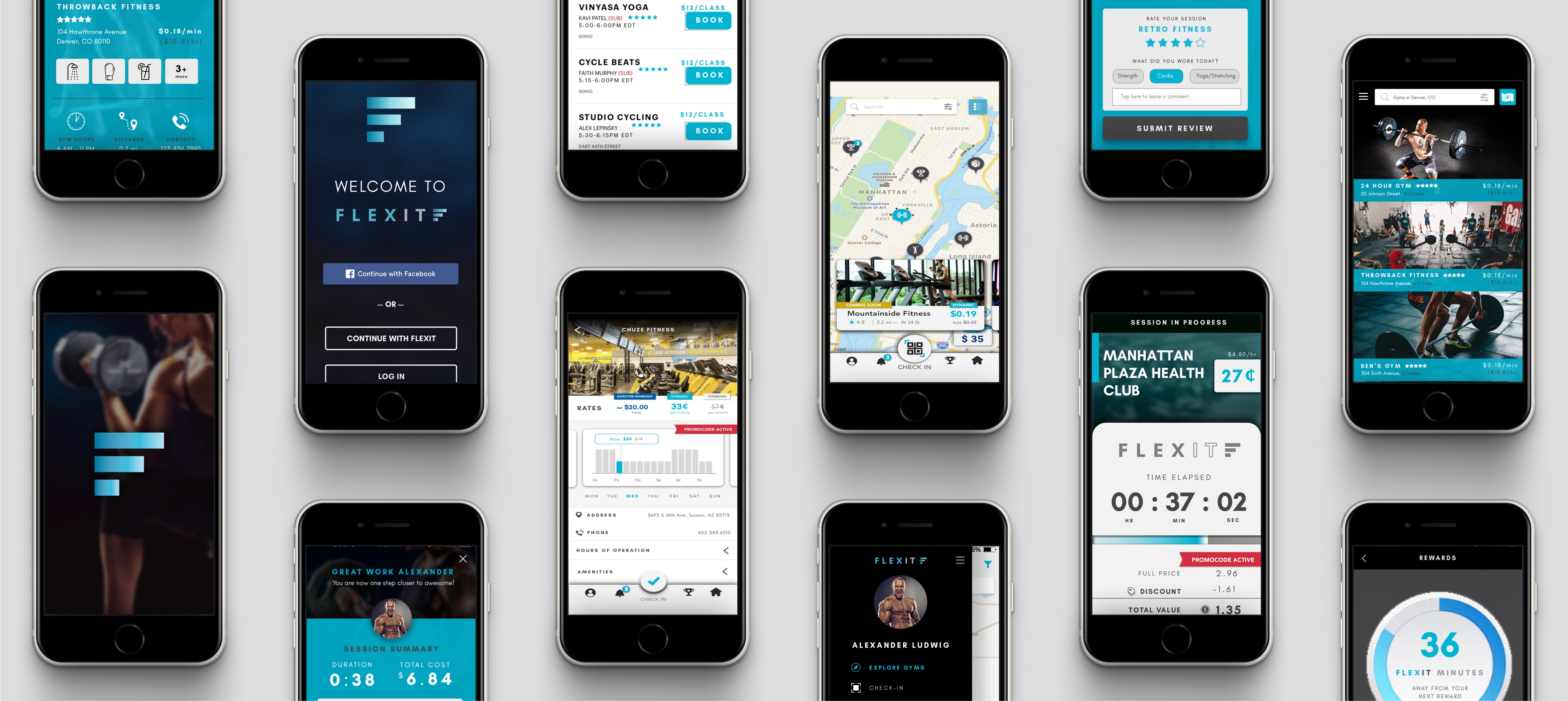
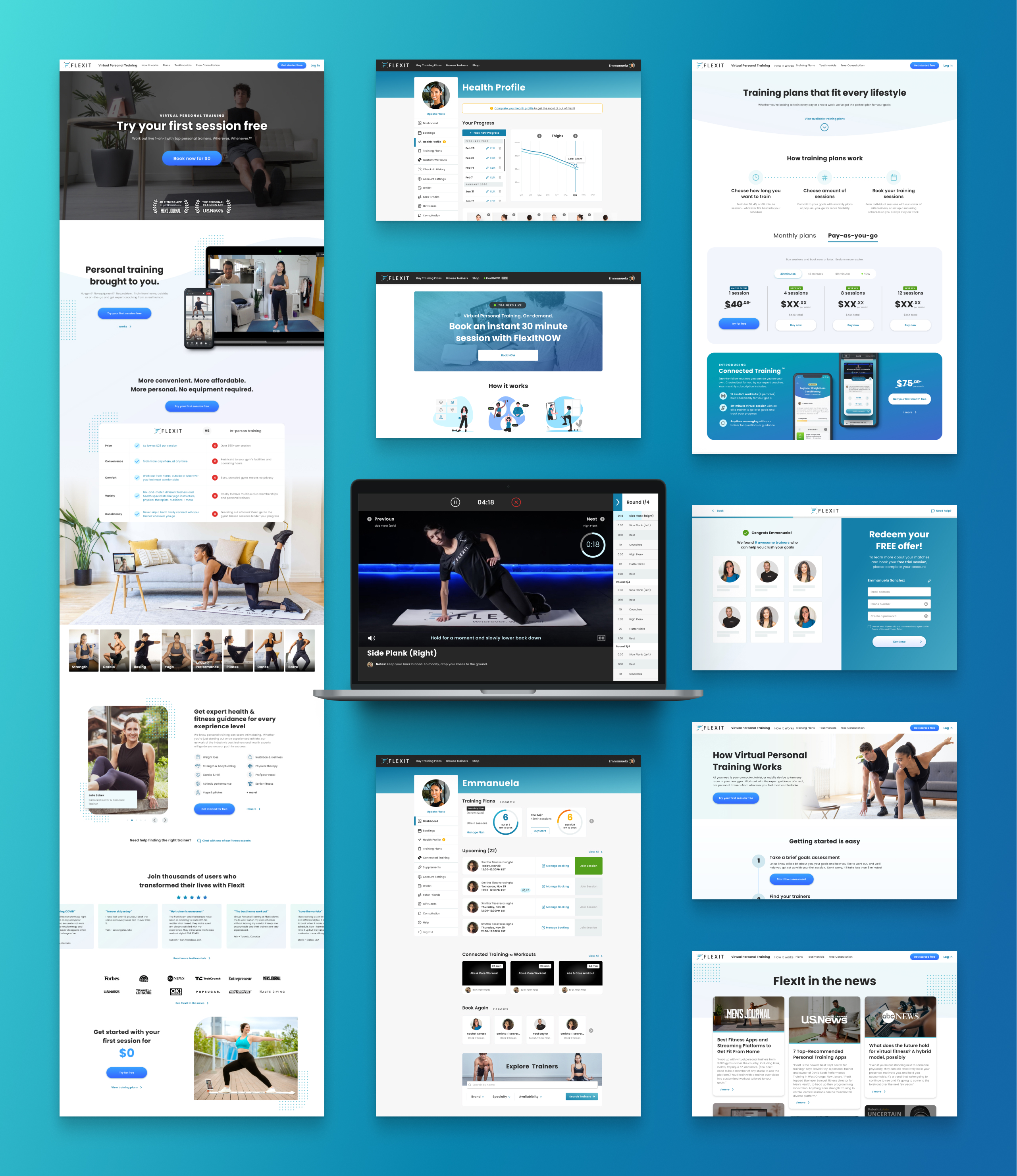
FlexIt's original branding was hyper-masculine and intimidating. But our customers weren't gym bros—they were middle-aged women who were new to fitness.
As we grew from a design-team-of-one (me) to six designers across marketing and product, our visual identity became diluted and lacked cohesion.
Without documented patterns and components, developers built everything ad-hoc—leading to redundant work and messy code.
After an extensive landscape audit, focus groups with customers, and brainstorming sessions with stakeholders, we began to understand where FlexIt should sit in the market. Fitness can be intimidating, so to entice new customers to try an online personal training session would require a much softer, more approachable brand.
A fragmented brand and product experience leads to frustration and distrust. We wanted our brand to reflect our expertise in health and fitness, especially during COVID—when health was top of mind for the world.
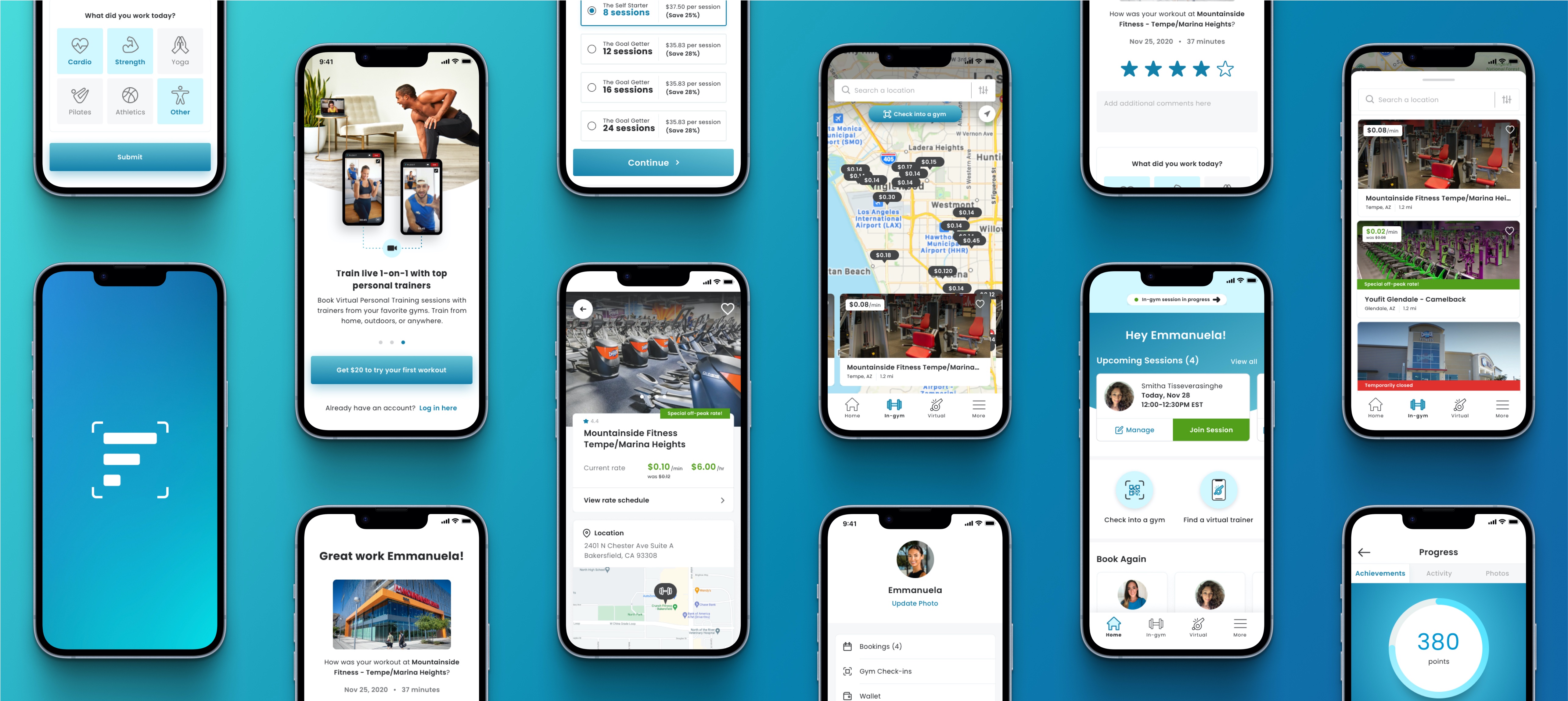
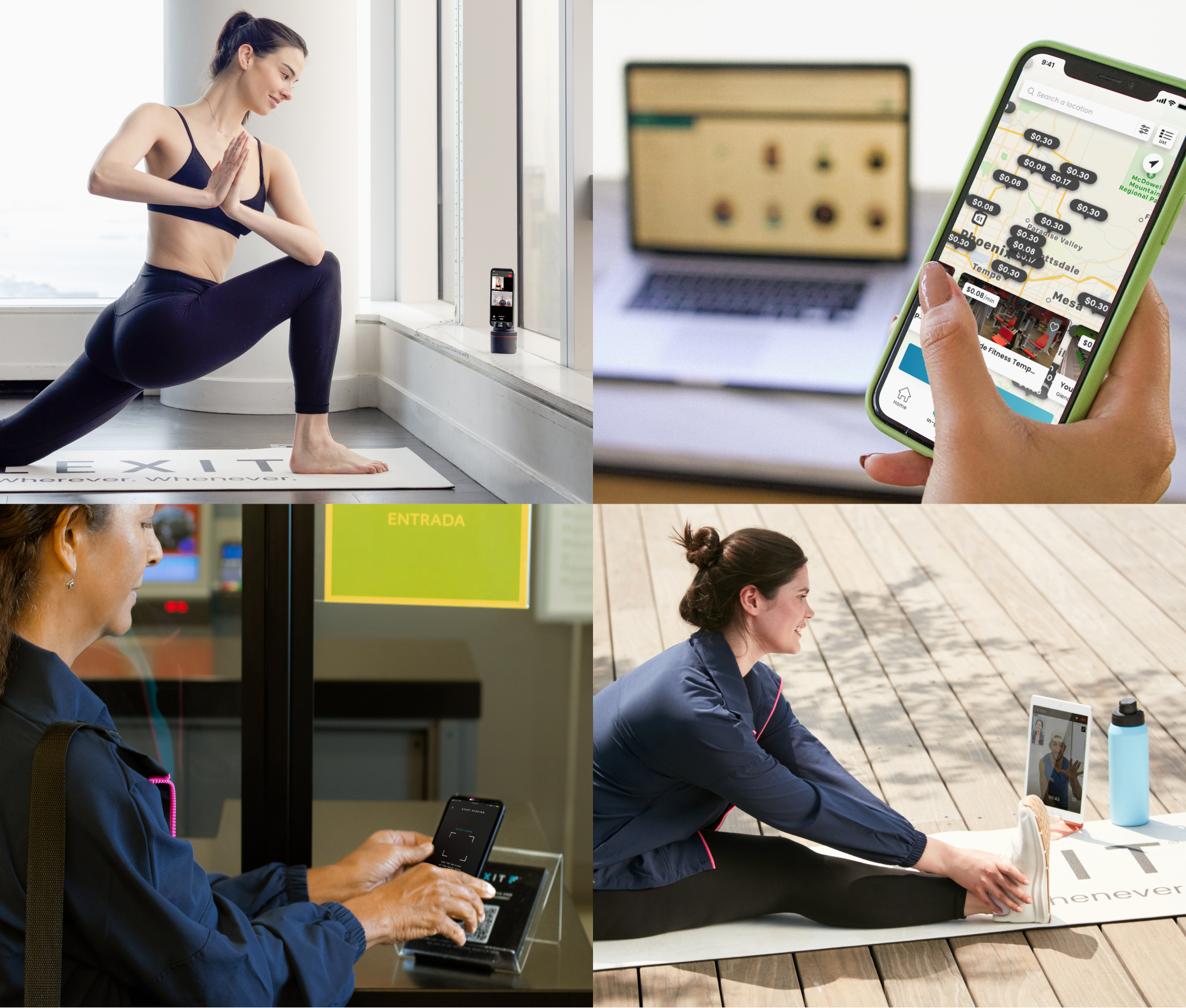
Beyond personal training, we also offered other virtual health sessions such as physical therapy, meditation, and nutrition guidance. To highlight the variety and flexibility of our services for a diverse customer base, our brand needed embody inclusivity and accessibility—wellness is for everybody!
The standout competitors in our audit had strong, concise branding with a unique personality. At FlexIt, we wanted our brand to tell a story of inspiration and success from our all-in-one wellness solution.
For continuity with our brand legacy, we wanted to maintain blue as FlexIt's primary colour. I refined our palette to be softer and brighter, with special attention to accessible colour pairings.
Our original brand typeface, Glacial Indifference, was hard-edged and extremely limiting (with only two weights). After exploring various font pairings, we transitioned to Poppins—a geometric sans serif typeface with rounder forms and a rich font family. Its versatility allowed me to create a robust type hierarchy.
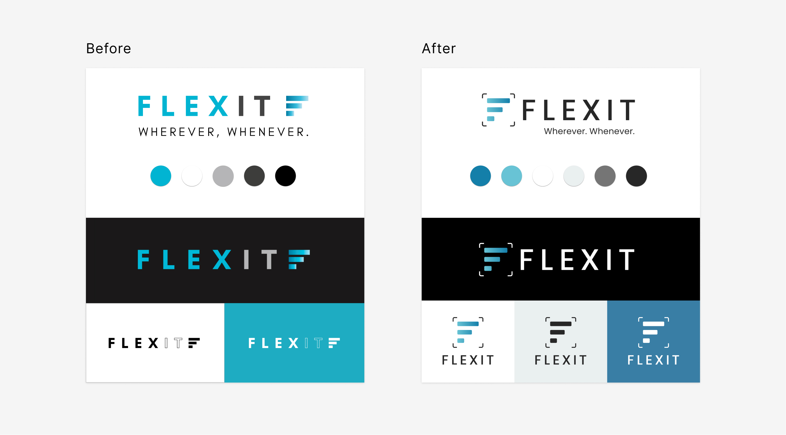
Utilising our new colours and typeface, I refreshed our logo for a lighter, more approachable feel. Keeping the FlexIt “F” emblem—our signature brand mark—I rounded the edges and surrounded it with brackets (a nod to our QR code check-in system for our in-gym product). This new emblem could stand better on its own, making a better vertical lockup and more versatile in different environments.
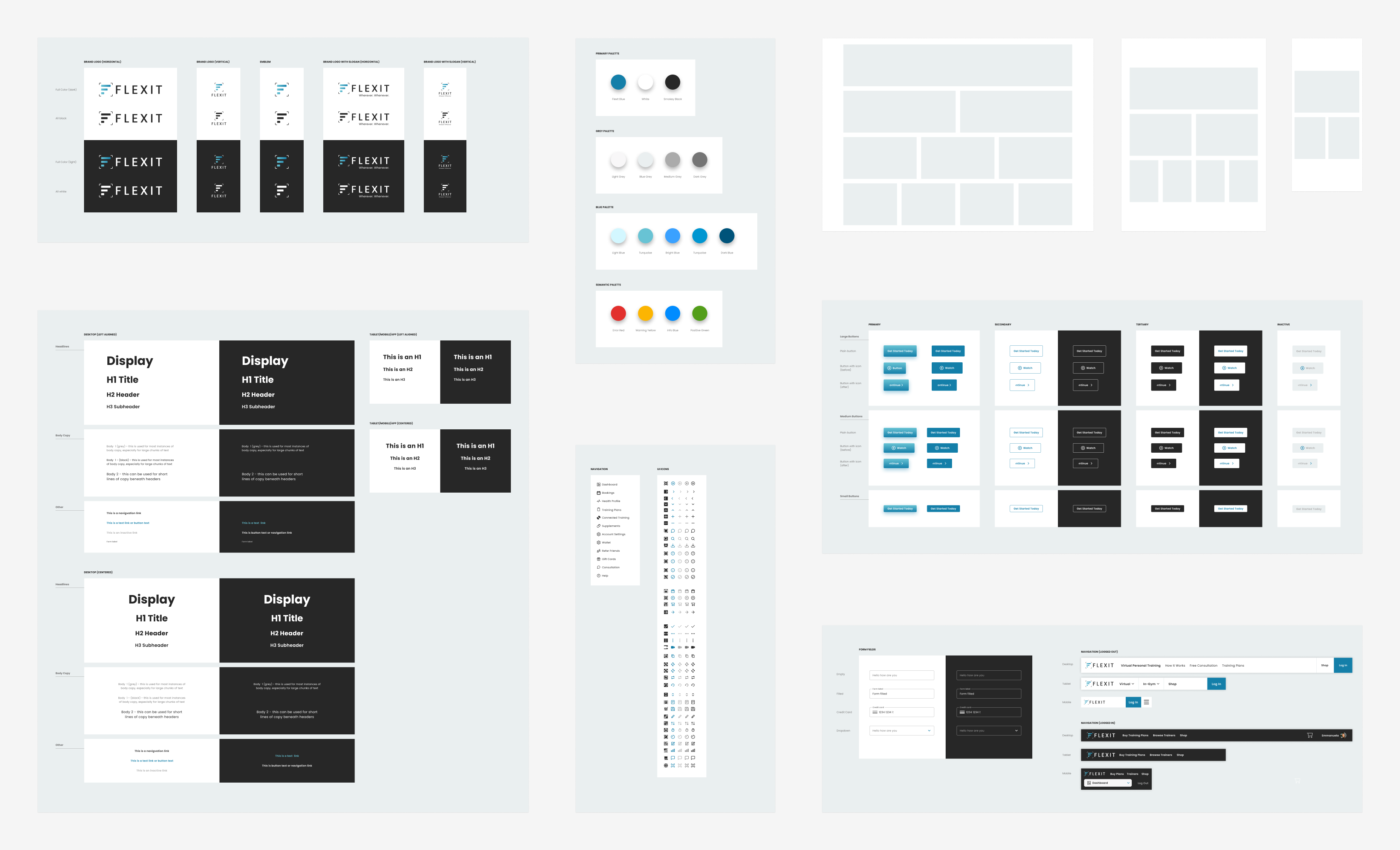
Back when we all used Sketch, we had Sketch Libraries. Though it was rudimentary compared to the fancy Figma of day, I leveraged this feature to build the foundation for FlexIt's first design system. After documenting core type styles, colours, icons, button, and other reusable components that made up FlexIt’s digital ecosystem, I worked with engineering to translate this into code. This became a living document that expanded with subsequent releases, which helped automate our design and development process.
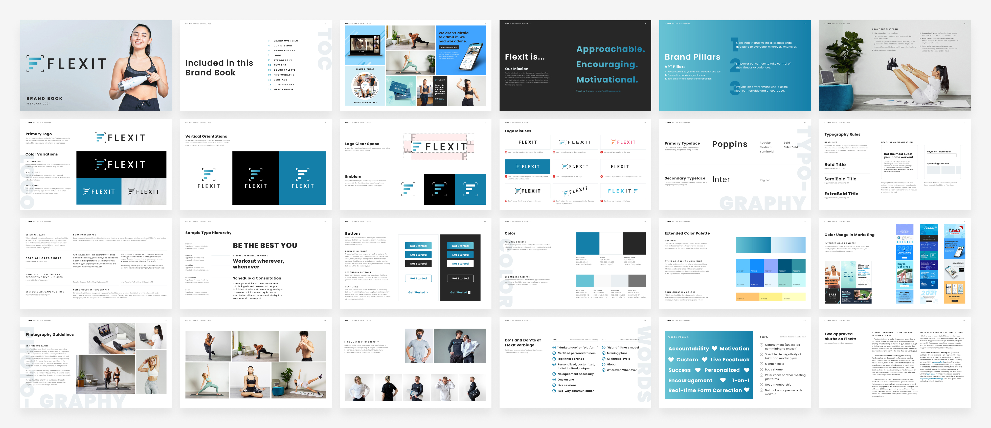
Expanding upon our product design system, I worked closely with our Senior Brand Designer to build a brand book that documented rules and guidelines for creative assets across all our touch points. We outlined proper logo usage, colours, typopgrahy, photography styling, and brand voice for copy. This document acted as a source of truth for my team, giving designers the space to be creative within the boundaries of our brand.
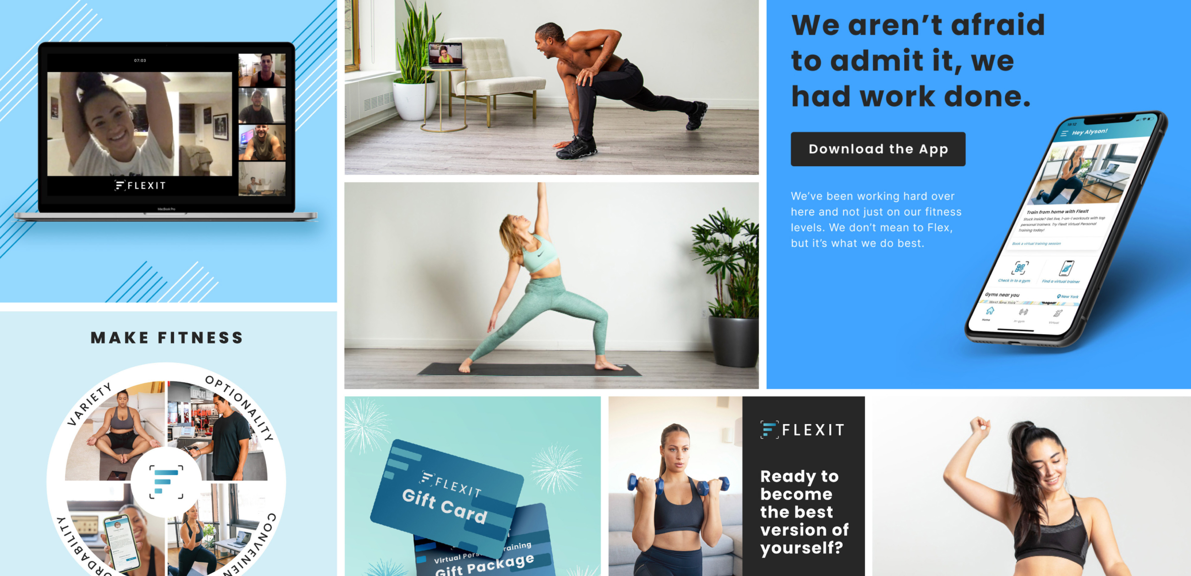
With the tools and guidelines to design in unison, we transitioned all of our touch points into our new visual brand identity. On the product side, we also evaluated and optimised the user experience before applying the design system UI. As FlexIt continued to grow, we leveraged the design system to build and ship 3 core products:


"Best Home Training Apps - Most Personalized App"

"This easy-to-use app offers all the perks of a fitness studio from the privacy of, well, anywhere"
To learn more about this project, feel free to reach out to me.